Bo’s Dog Food Brand
Website Case Study
Scroll to explore


Project Overview
The product
Bo's Organic Dog Food is a premium brand that offers high-quality, natural dog food made from the finest organic ingredients. Building a responsive website for online sales and delivery is the next step for the company.
Project duration
September 2023 - October 2023
The problem
The previous co-delivery system was frustrating users and customers aside from general bugs and design malfunctions.
The goal
Design a delivery system website for Bo’s so that users can process their online orders.
My role
UX designer designing a website for Bo’s from concept to delivery.
Responsibilities
Conduct user research, paper and digital wireframing, and low and high-fidelity prototyping.
Conducted usability testing, accounting for accessibility, and iterating designs.
Understanding the User
-
User research
-
Personas
-
Problem statements
-
User journey maps
User research summary
By conducting interviews and surveys, I got to understand the users that I am designing for and their needs. One of the primary groups of users identified through the research was adults of all genders from age 25-35.
Besides this group of users, the young adults were very interested in the ideas as they loved things to be online. According to the surveys, users were more likely to create an order if the process was simplified.
Pain points
Time
For adults having an online delivery for dog food helps save time as they won’t have to make separate grocery trips for quality dog food.
Accessibility
The large amount of dog owners are not tech savvy and users that have support animals need be able to feed their helpers.
Information Architeture
Many Dog food websites are filled with unnecessary information that is hard to understand or is not relevant.
Persona

Problem statement
Mandy takes care of two dogs who are active and healthy. She works 12 hour shifts so she wants to order dog food online but the process has been frustrating and time consuming.


User Journey Map

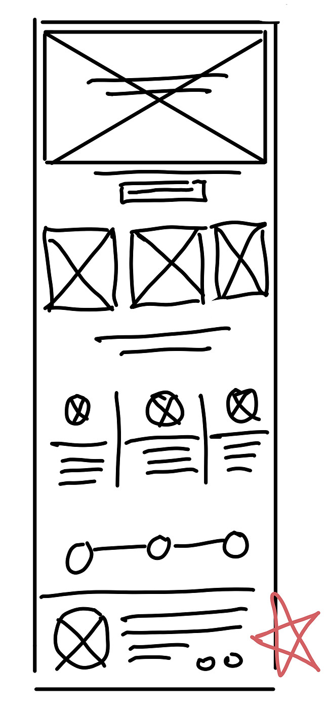
Paper wireframes
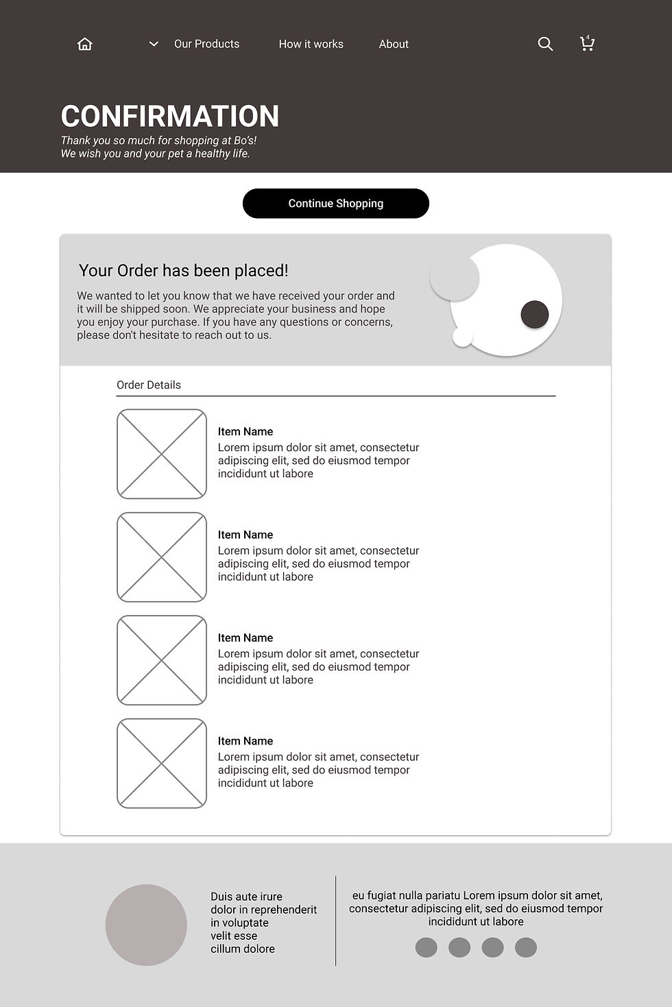
Taking the time to draft the iteration of each screen through paper wireframes. That get made into digital wireframes.


Digital Wireframes


Low Fidelity Prototype

A lo-fi prototype of Bo’s website was developed for usability test with potential users.
Usability Study
There were two usability tests conducted the first round helped guide mockups and wireframes. The second round was for refining the high fidelity prototypes.
Round 1 findings
Users wanted to have a progress bar for the order process.
Users were struggling with the layouts of products.
Users noted that the flow lacked a few back buttons.
Round 2 findings
Users felt that a product page would help in adding details to products.
The use of icons was appreciated by users and they wanted to see more integrated.
Starting the Design
-
Paper wireframes
-
Digital wireframes
-
Low-fidelity prototype
-
Usability studies
Refining
the design
-
Mockups
-
High-fidelity prototype
-
Accessibility
Mockups


A progress bar was added to the whole ordering process and the back button was added to the checkout page.
Back Button
Progress Bar
The products were organized into categories and had simple interfaces. They also have a product overlay with more details about the product.


Before Usablity Testing
After Usabilty Testing
Before Usablity Testing
After Usabilty Testing


Mock
Shots
High Fidelity Prototype
The Hi-fi prototype for Bo’s was packed with components that successfully simplified the designs and accelerated the user flow.

Accessibilities
Used Icons to help make navigation around the site easier.
Used appropriate colors for accessibility according to webAIM: Contrast Checker. As well as used striking color for call to action buttons.
Added Alt text to images for users that are vision impaired.
Going forward
-
Takeaways
-
Next steps
Takeaways
Impact:
The website and delivery system successfully helps user save time and reassure them that it is the best food they can get for their dogs.
What I learned:
While designing Bo’s website I learned responsive web design and the use of Adobe XD. I learned to adapt to insights, designing for mobile, creating wireframes, prototyping, usability studies, and integrating feedback..
Next Steps
Conduct more usability test to see whether everything is working.
Integrate more design systems for a more fluent user flow and experience.
Let's Connect!
Thank you for reviewing the Bo’s Food website If you’d like to see more.
Get in touch, my contact is provide below.
