
Project Goals
-
Redesign website focusing on responsiveness and brand identity.
-
Create interactive elements in the website and update links.
-
Perform user testing to improve user experience.
My Role
UI / UX Designer
UX Researcher
Framer Web Designer
Prototyping
Project Overview
Qodesh, a Christian Rock band from the 90s, had a website built on WordPress. The band wanted to redesign their website to ensure it was responsive to various devices.
Project Timeline (April 2024)
Figma prototype
Design user
testing
Framer web design and development
Responsive and functionality testing
User research


Persona
User Journey Map

Randy Osbourne, a business analyst by day, transforms into a rock disciple when the sun sets. Qodesh’s electrifying chords transport him to mosh pits and guitar riffs. His vinyl collection signed drumsticks, concert posters bears witness. But Randy’s passion extends beyond music. He’s a wanderer, tracing cobblestone streets in Italy and France. Cathedrals and espresso fuel his soul. If you spot a man humming “Dead in California” in a Tuscan vineyard, it’s Randy the seeker of grace in melodies.
-
58
-
Business Analyst
-
Evansville, IN
-
Works for Berry Plastics
-
Loves to go on adventure with his famlity and dogs.
Randy Osbourne
"Fast Learner"


Scenario
Randy needs to want to find Qodesh's newly revamped music and send them a message about how much their music means to him.
Expectations
-
Clear indication of where to find music.
-
Able to leave a message or find contact information.
-
Try using a different kind of navigation bar that is either fixed or traditional.
-
Could add a component to play music on the site.
-
Use a mix of buttons and links then update links.
-
Could create a separate page for contacts.
-
Contact information can show up in other parts of the page.
Opportunities
Map model from usability.yale.edu
Mobile
Desktop


Navigating around the site
-
Commonly occurring navigation on web.
-
Mobile navigation looks good but gets confusing with the fixed icon.
Playing Qodesh music
-
No way to play music in web or mobile
-
Links could look better and on mobile is easy to miss.
-
No links to lead to the music except for the videos.
Contact Qodesh
-
Need more contact information.
-
Hard to find contact information.
Pain Points
Before Redesign
-
Lack of mobile responsiveness
-
Lack of clear call-to-action buttons
-
Unattractive or outdated visual design
After Initial Prototype
-
Confusing navigation.
-
Links need to be clickable and updated.
-
Contact information is hard to find.
User Research
Qodesh has been releasing remixed music, and the band's website is essential for fans, potential listeners, and event organizers. My UX research aimed to find areas for improvement and make the overall user experience better.
Methodologies
-
Interviews: Conducted one-on-one interviews with existing fans and new visitors
-
Usability testing: Three usability tests were conducted at different stages of the design process.
Research Objectives
-
Understand user needs and expectations.
-
Evaluate the website’s usability and navigation.
-
Identify pain points and opportunities for optimization.



Redesigning in Figma
I started the design process using Figma, a collaborative design and prototype tool. During the product redesign, the established brand colors, typography, and imagery received a visual enhancement through the new layout, incorporating various improvements based on research data.
Mockups
I used the original website's themes as inspiration to design these mockups. I prioritized a mobile-first approach, aligning with over 50% of users accessing their website via mobile devices.


Old
New


Refining designs in Framer
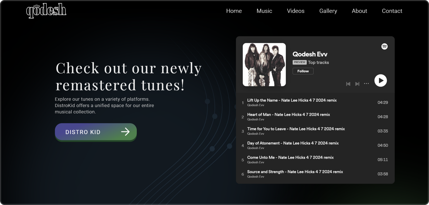
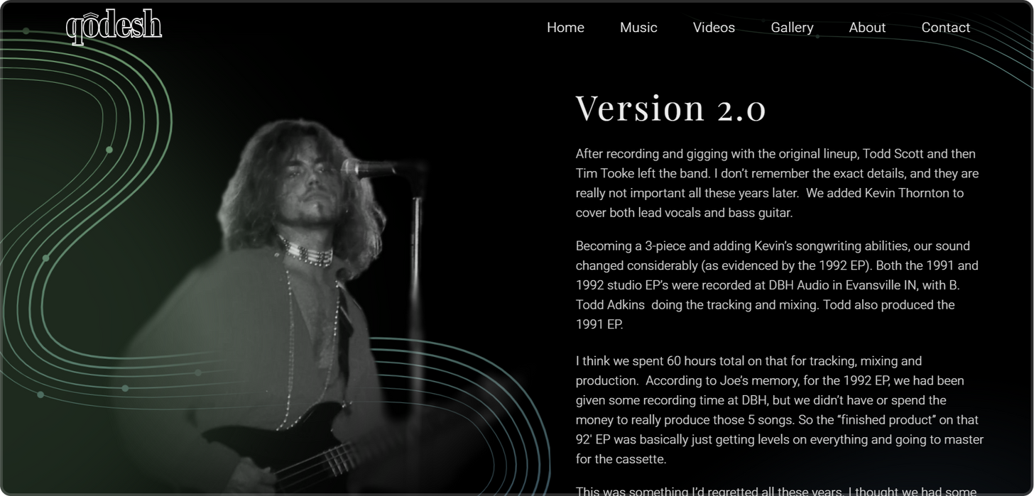
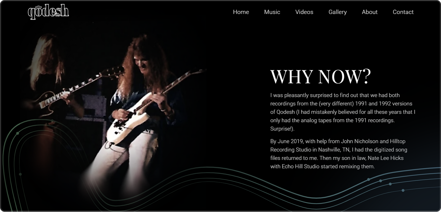
I used the unpublished site in Framer to create a high-fidelity prototype, allowing me to enhance the visual aesthetics and interactivity of the product.


Responsive Web Design
To ensure the site is responsive, I created three breakpoints and tested the auto layouts and stacks to ensure they display well on any device.
Mobile

Tablet

Desktop / Laptop

Screens and Final Product
You can scroll through these screens to view the final product or click the button below to go to Qodesh's website.
Body Colors
Background
#000000
Secondary
#338248
Accent
#336482
Type Color
#E0E0E0
Typography
H1
60px
Playfair Display
H2
32px
Playfair Display
H3
28px
Playfair Display
P1
Roboto 20px 0.02em
P2
Roboto 18px 0.02 em
P3
Roboto Thin 16px 0.02em
P4
Roboto Icon 12px
Design System
I noticed that my designs in Figma lacked unity, which affected the product's visual identity. Therefore, while designing and developing in Framer, I created a design system to unify the aesthetics.
The system included various fundamental elements such as typography, colors, iconography, components, and CMS (Content Management System) assets.
Navigation & Footer


Takeaways


Impact
After the redesign work on Qodesh's website, we observed a more than 75% increase in user engagement and satisfaction. Improved navigation and visual appeal, along with optimized content layout, led to higher interaction and time spent on the site, as well as improved conversion rates.
These positive outcomes demonstrate the effectiveness of the UX design in enhancing Qodesh's online presence and user engagement.
What I learned
Throughout this project, I delved into the intricacies of responsive web design, honed my skills in effective client communication, explored the seamless integration of research in design practices, and deepened my understanding of user experience design principles.
This experience has significantly enriched my knowledge in these areas and has allowed me to grow both personally and professionally.

Thank you for Reading
Thank you for taking the time to go through my case study. I would appreciate your feedback and any comments you may have. Your input is precious and will help me improve and grow professionally.
Email: rk151@evansville.edu
Contents
Click on these links to skip to a specific section
You can also scroll through the contents of this page.


